Art Is Easy to Make!
Acrylic Painting by Poochie Myers
Lesson 21
Review of all art lessons
Thoughts on painting by Joe Loeber
Less is more with Joe Loeber
Scraping pastel onto surface + gel, oil, or soap
Small is best
Use a camera to photo the little compositions and blow them up big
Always start small
Develop from small and use the same method for big that you used with the small.
Limit color range
Always mute colors (nothing loud)
Use gels, oil, gel or soap
Careful to leave white space between colors.
Hints for composition
Choose your colors and make pallet (like choosing a language)
Choose your mood (like writing a story) be emotional – express yourself
Use restraint (get most with the least)
Begin with one thought (one design) and expand it to variations on a theme
Be consistent in shapes
Always have the pattern in mind
Structure comes first (like building a house)
Add anything to the structure
Color can balance the design
Keep it clear and simple
Have the light in the center
Concentrate towards center
Don’t take light to the outside edges
Thin lines appear to travel fast
Dark to light shading is interesting
Round shapes let you rest
Scraped paint indicate high speed
Lines that are thick and thin say a lot
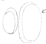
Add secondary lines to stabilize your design (see illustration)
Where is your spot of interest?
Where does your eye land? (think of helicopter pads)
Where is the entry?
Where is the exit?
Look at your positive and negative shapes?
Check painting with small and large mats to see small areas?
Is the work consistent?
Is there continuity of color and design?
Did I get by with breaking the rules?
Underpaint with thin washes (in complimentary colors if you can)
Charge and parry with line and design .(see illustration)
Juxtapositions give illusion of space
Emphasize and de-emphasize line, shape and color
Enhance and variegate the areas.
Remember to think in patterns
When you decide straight – stay straight
Do shocking and surprising things.
Non-objective is from the inside out – feelings!
Dynamic on top of structure can work but structure on top of dynamics irritates.
Green and orange are dynamic colors (move) because they are made with yellow.
Purple creates tension, not dynamic – it is a neutral color.
Magenta will bleed into everything usually
Blue rises, Red sinks, yellow moves
Don’t show hesitation – it all must be done with conviction and drama. A hesitation attitude destroys the painting.
Do not bore yourself and do not bore us.
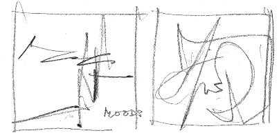    
Dynamics or Structure - decide on one or the other. 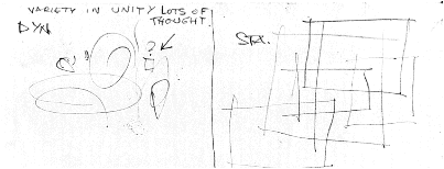  Design from your name Design from your name 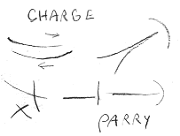 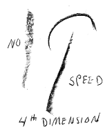
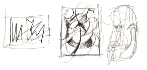
Exercises to develop your composition sense.
.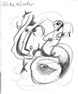  Secondary lines Secondary lines
Exercise: using the same type shapes and adding secondary lines play hide and seek to discover the images you can develop from the shapes. OR
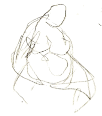
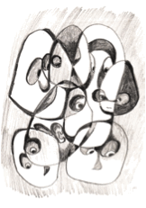
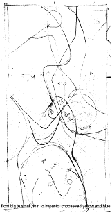 Exercise 2: Large spaces first then secondary lines, etc. Use complimentary colors with white and black and many shades in-between. You can develop into realism if you want or leave abstract. Exercise 2: Large spaces first then secondary lines, etc. Use complimentary colors with white and black and many shades in-between. You can develop into realism if you want or leave abstract.
Poochie Myers, Huntington Museum 2008
and many thanks to Joe Loeber, Key West FL
|